Business Problem
The number 1 reason students do not attend or complete college is because of financial hardship. Many students are struggling to pay for higher education because of the rising expenses associated with college tuition and living expenses, even with financial aid. Students and their families are stuck with the option of taking out more loans or working to pay for school. Usually, these solutions only provide temporary relief since the loans keep accumulating, or students find it difficult to manage their work and studies at the same time.
Research Objectives
1. Understand how students currently go about receiving financial support for their education
2. Understand how comfortable students are in taking help on social media and from extended family and friends
3. Understand the level of involvement donors & recipients want to have with each other
4. Understand how students prefer to receive support / donors like to give support
5. Understand how donors currently go about donating
Solution
ScholarRise aims to leverage the support network that students already have around them. Scholars(students) share their college needs with their community of supporters also called donors. Donors can access our easy-to-use tool to see their scholar’s needs and meet them all in one place. The all-hands-on-deck approach enables students to concentrate on their academic path with greater ease.
Duration
9 weeks
The Team
Lesha (Me) - UX/UI Designer
Joyce - UX/UI Designer
Candice - UX/UI Designer
Tools
Figma, Trello, Google Forms
Process
User Research (Survey, interviews, competitive analysis, affinity mapping, coding survey responses)
Define needs (Persona, journey map, user flow)
Design (Sketching, wireframing)
Develop (Mid- fidelity & high fidelity prototypes, usability testing)
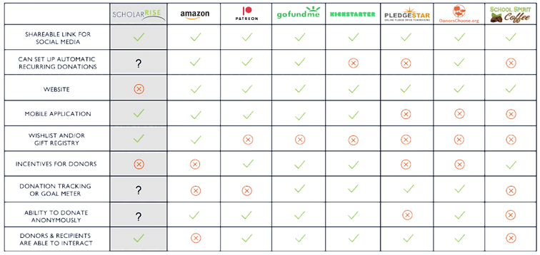
Competitive & Comparative Analyses
I gathered some of Scholar rise's competitors based on target audience, preference on giving/receiving support, privacy, and social media sharing, then noted the differences between each website’s features and layout.
User Research
Quantitative method
We created an educational support survey to get insights on our research objectives. We conducted a survey because we believed it would give us a chance to reach a high number of people to give reliable data that would help us understand our objectives. We surveyed 66 people and received the following answers
Qualitative method
We had to interview people that use similar products to ScholarRise. We then interviewed 8 of those people to get in depth explanations of their answers.
Affinity Mapping
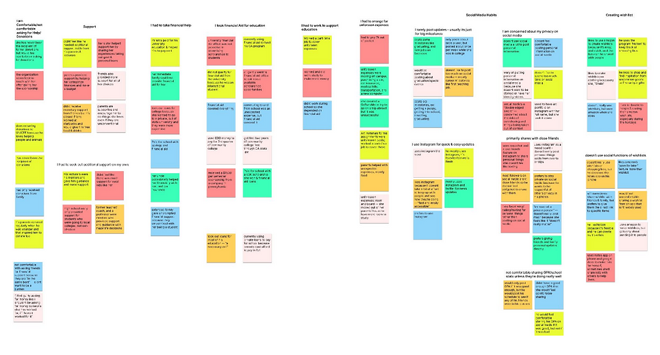
User Interviews- Key Insights
1. Majority of users had to seek out additional support on their own, but are not comfortable asking others for help
“I’m not comfortable with asking friends for financial support because many of them are in the same boat and I don’t want to be a burden”
“I feel guilty asking for money someone else has worked for, if I haven’t worked for it”
2. Privacy concerns about posting information online
“I don’t like to post too much on social media - mostly career milestones like for a new job.”
“I like instagram because it doesn’t take a lot of effort to keep up with people and see how they’re doing. It’s fast, easy, and accessible.”
3. While most are familiar with the wishlist feature on websites, they don’t use it for social functions
“I use amazon to make wishlists, but get shy about sending it to people ”
“I’ll sometimes share wishlists with friends & family, but I prefer to give them the direct link to specific items”
Usability Testing
We did usability testing on original site to get feedback from users.
-
5/6 experienced difficulty completing their tasks due to navigation errors and confusion
-
50% of users left the app to share their ScholarRise wishlists
-
50% of users want the option to put specific items on their wishlists
-
50% of users were underwhelmed with the design aesthetic
Defining Issues
Students need a way to personalize their profiles without revealing too much private information so that they can successfully solicit donations from people they may not personally know.
ScholarRise app needs updated design and clearer feedback so that students will feel comfortable putting in sensitive information
Ways to solve issues
…create an environment where students feel comfortable sharing updates so that donors can stay connected and provide more personalized support?
…create an environment where donors and students feel connected without compromising the privacy of either?
…make the ScholarRise mission clear, appealing, and trustworthy for users?
Persona
In order to figure out the unique frustrations and needs of ScholarRise's ideal client I created a qualifier questionnaire to first target the correct market group, then surveyed the qualifying participants on how they donate and receive donation . From the interviews I compiled similar insights to create the following persona, who portrayed the pain points and needs of an ideal user.

“People want to support students but are looking for simple ways to do so. The Scholarrise app is a user friendly, has a nice format and gets straight to the point in meeting students needs”
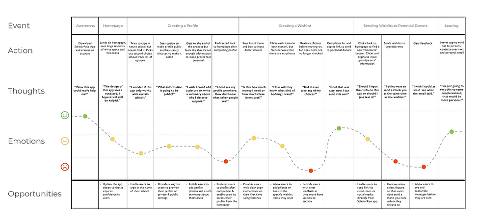
Journey Map
This flow indicates the users emotions and experience as the user tries to share their needs on social media, message others about their need for donation, and ask for help from donors through posts on social media for donations. (Cyclical Process)
Feature Prioritization
Our feature prioritization was informed by our research and our time frame. Since we have such a short amount of time and limited resources, we wanted to focus on high impact and low expense solutions. We decided we wanted to design:
● profile customization to allow users to personalize their profiles to make them more comfortable and to give them control of how they are perceived
● basic privacy controls that would allow Julian to control whether his information was available publicly
● donation tracking, so that students and donors can follow the campaign together
● meaningful student community interaction that doesn’t feel forced or invasive.

Sketches
We created sketches for each screen and chose one variation of each to create the first iteration of the app. Some key features we knew we wanted to include:
-
Create Account / Account Dashboard - we prioritized milestone and donation updates on the account dashboard to encourage students to share updates and stay connected
-
Student Profile - most interviewed users felt most comfortable sharing updates about their lives on social media, instagram specifically so we took cues from that to help them feel comfortable with the ScholarRise platform
-
Campaign - eliminate wishlist and just do cash because that’s what most stated would be preferable and more helpful. We sketched multiple solutions for the campaign dashboard and ultimately landed on one that focused on the visuals of campaign progress so that it would be quick and easy for both students and donors to see where they were at in their campaign.
-
Posting milestones - Cues from instagram to make it easier and more comfortable to share on the scholarrise
-
Account settings - Sharing information and privacy was one of the biggest concerns with users in our interviews, so we added screens to enable more privacy controls and added a nickname field to protect users’ personal information


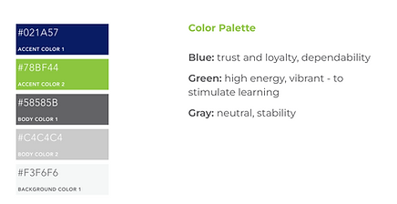
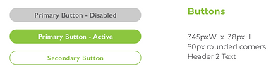
Branding
We looked at other Scholar Rise to ensure we are keeping the branding consistent.

Site Map
We wanted the site map to add more depth to the site and flash out certain sections, with the goal of helping users to navigate the site, and make it more competitive.

Mid-fi Wireframes
we used our style guide and prospective site map to inform our mid-fi wireframes.
1. Account Setup
-
providing feedback to guide users
-
added measures for more security
-
menu to manage notifications and privacy controls


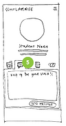
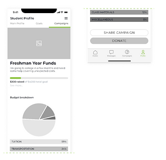
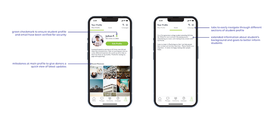
3. Student Profile
-
Flexibility to share as little or as much information they would like with display name and goals
-
green check mark to ensure user is a verified student and reassure donors who are wary of fake profiles

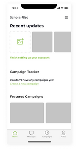
2. Account Dashboard
-
Emphasis on milestones, and featured campaigns to encourage connecting with the community
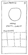
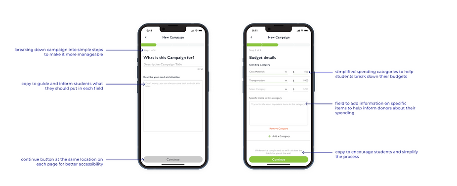
4. Create a new campaign
-
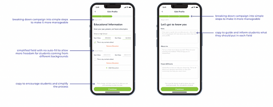
Progress bar and more feedback to retain the attention of users who may get overwhelmed by long setup processes

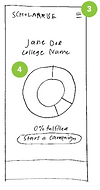
5. View Campaign
-
Making campaigns more visual for users who are more accustomed to quick checks
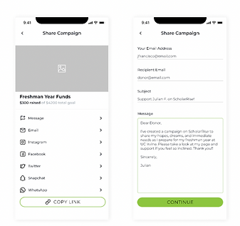
6. Share Campaign
-
Increased sharing options to cater to students who are more social media savvy
-
Field to customize message to make it more personal for donors
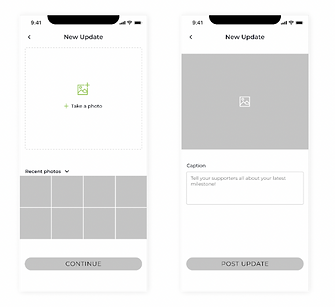
7. Posting Milestones
-
Making campaigns more visual for users who are more accustomed to quick checks
Usability Testing and Findings
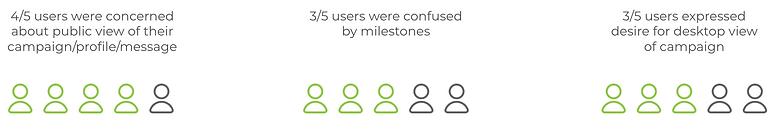
Our usability testing on the mid-fidelity prototype revealed that we still needed to make it clear to our users what their public facing view was. Those were some of Julian’s most repetitive pain points during his journey on the bubble app. Unfortunately we found that
Web Screens
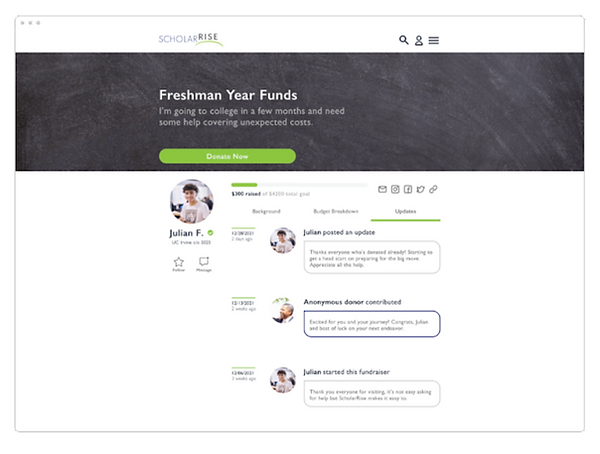
We designed a desktop view of our campaign since so many had mentioned it in our interviews. ⅗ users in our mid fi usability tests noted that potential donors would open the shared campaign link from their phone or desktop and that they would be less likely to view the campaign and support if they had to download an app and sign up. It also eliminates a lot of the workload for the donor, as they wouldn’t have to open the link, download the app, input their information to sign up, and input their financial information to donate – they can simply open the link and make a donation.
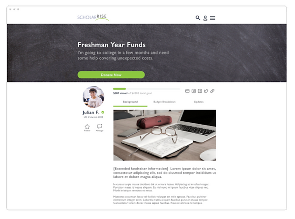
We iterated a few versions on a desktop view of a campaign and ultimately landed on a design that kept the basic structure and elements of the app but making the most of the larger screen to draw more attention to visuals and graphics

We also added a section for campaign specific updates to provide another channel for donors to follow the student’s needs and send encouraging messages along the way.
Hi-fi Wireframes
With our mid-fi usability testing takeaways, we revised our mid-fi prototype and updated the images and copy to bring it to life. *highlight improvements from usability testing results. Discuss the ways improvements and design choices address original problem statement and ensure an intuitive and enjoyable user experience for julian
We didn’t have to change much on the login screens because 100% of users had found it easy to navigate. We did, however, add feedback for password requirements and re-entering the password for added security.

On the homepage, we changed “recent updates” to say recent milestones because the inconsistency confused 60% of users in our previous iteration. We added text below to gently remind users when it had been awhile since their last update and to encourage them to keep donors informed

⅘ users had been concerned about the public view of their campaigns, profiles, and messages, so we changed the headings to make it clear when a student was viewing their own profile and added an “edit profile” button for quick access to update their profile when needed
In the new campaign flow, we finessed the budget details step to give users the option to add or remove a category and also continue without entering information for all the categories for more flexibility and ease of use.
For the campaign page, we added the option to edit campaign at the bottom to make it more intuitive and clear that the user was viewing their own campaign. We also added the option to send a thank you letter separately on the main campaigns page to eliminate confusion from when it was grouped with the campaign sharing option.

We added screens to view recent milestones as well a button to edit at the top to make it clear that users were viewing their own milestone and could easily edit it.

For campaign sharing, we found that less is more when it came to sharing options. Many users in our midfi usability tests noted that they were unlikely to share through platforms such as snapchat and wechat, so we eliminated those from the list. We also added a screen to give users a preview of their campaign sharing message and the option to customize it before sending it out because so many were concerned with the public view of their message.

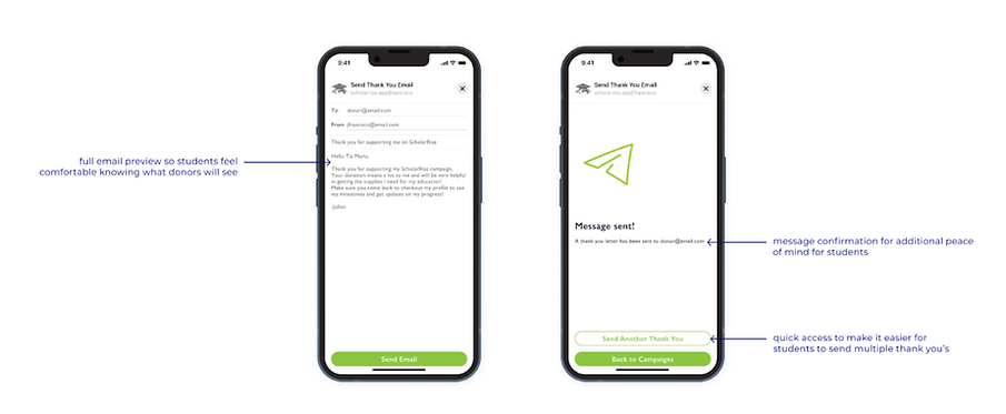
Last but not least, we added a way to preview and customize thank you emails, as well as a confirmation screen for additional peace of mind.